The high-stakes challenge
Sometimes, when brands evolve into ecosystems, their visual identities don't evolve with them. They multiply logos and hope the market makes sense of them. This creates confusion. However, in regulated financial ecosystems, identity is a signal. Closeness in visual identity of sub-brands implies shared risk. Distance implies protection and independence.
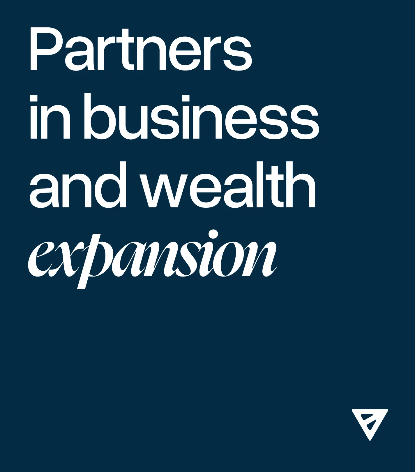
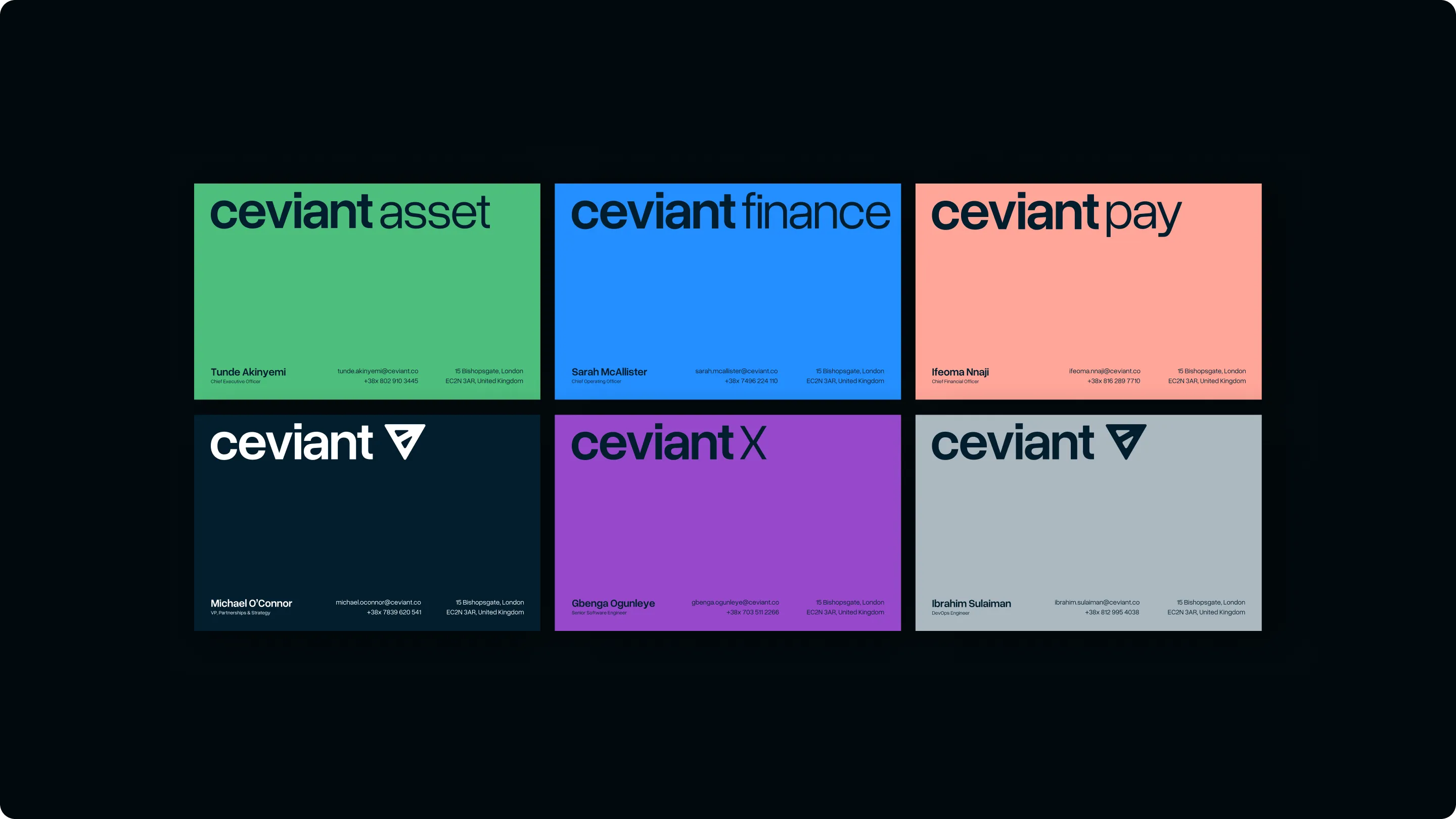
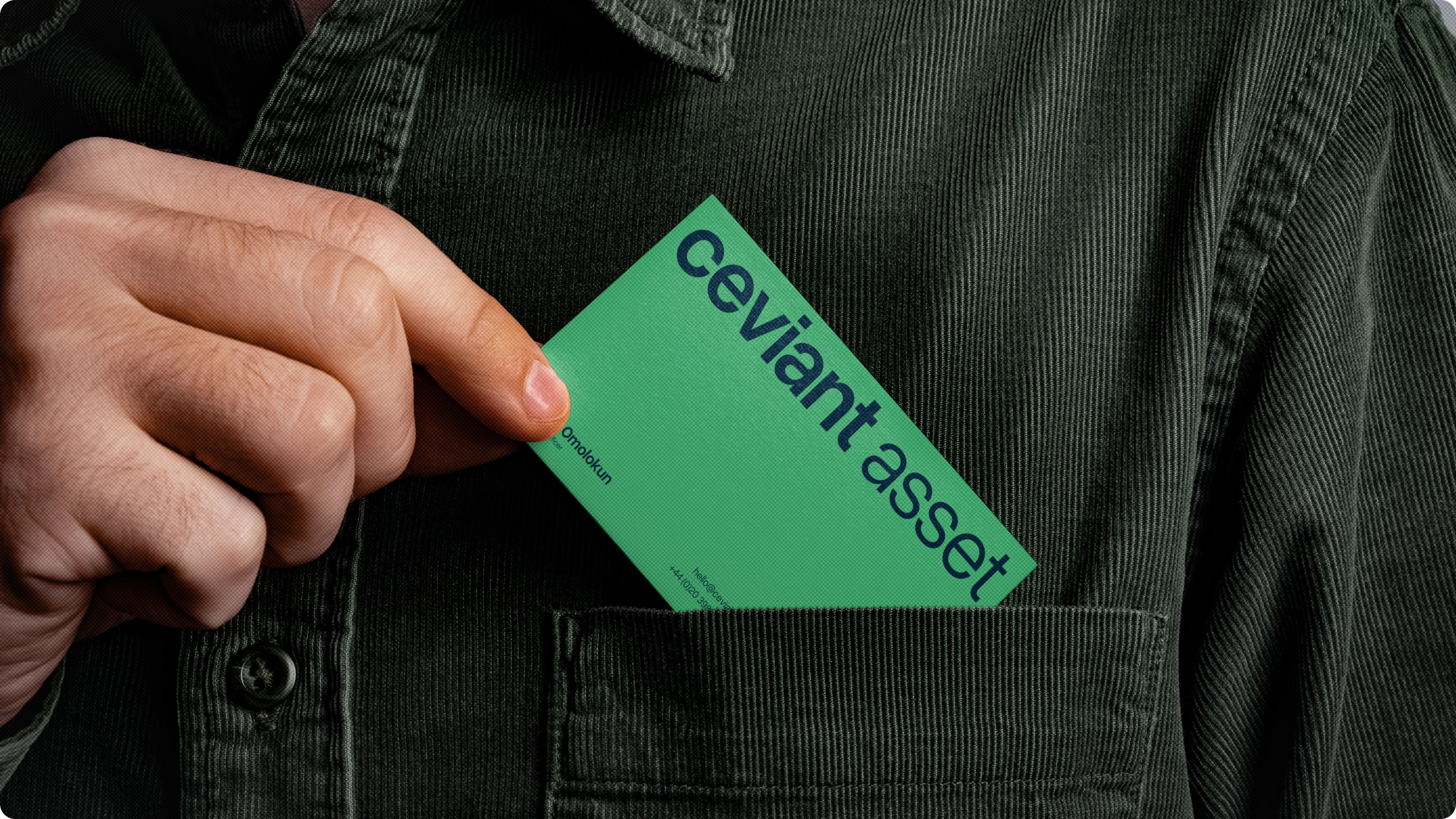
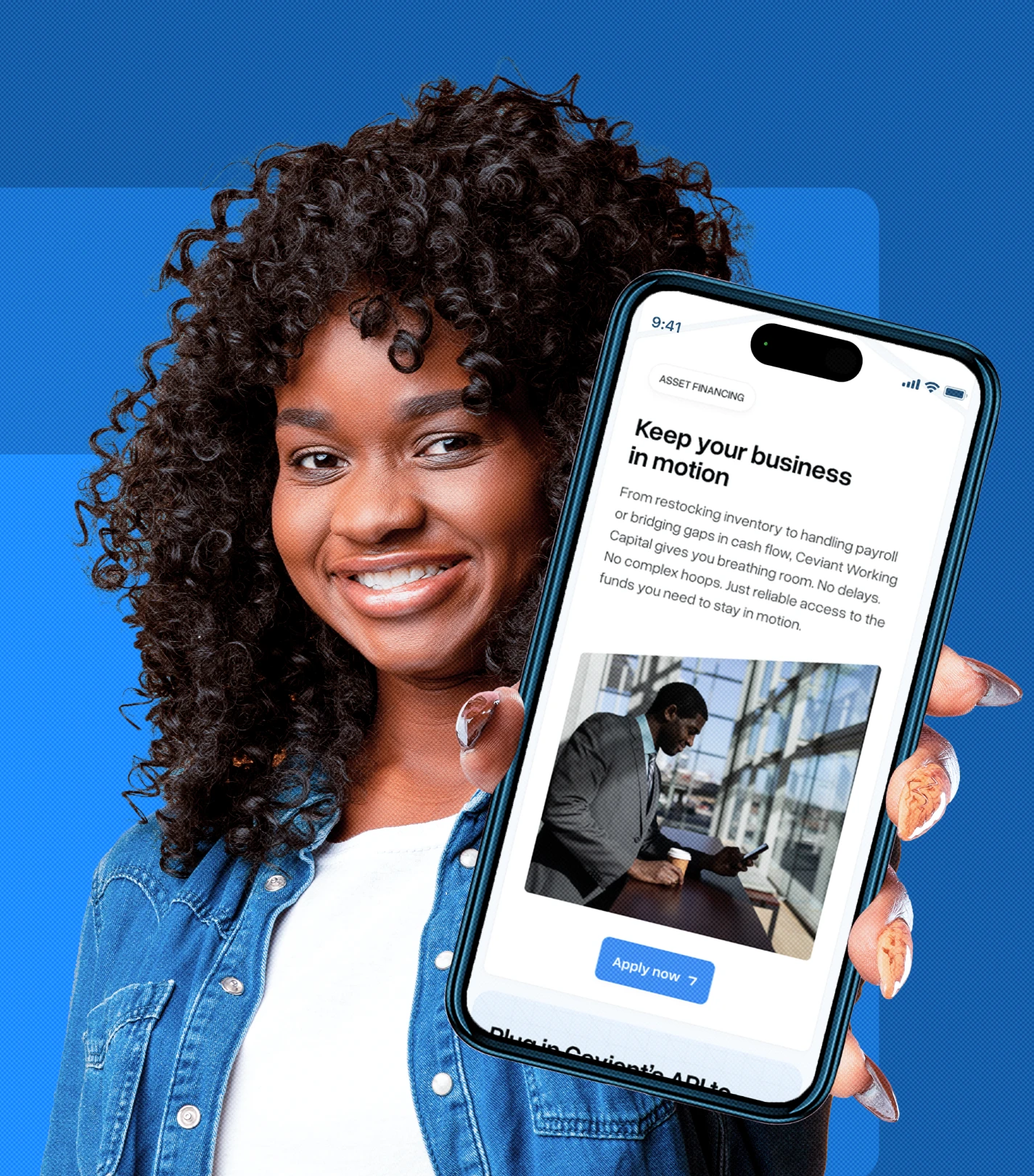
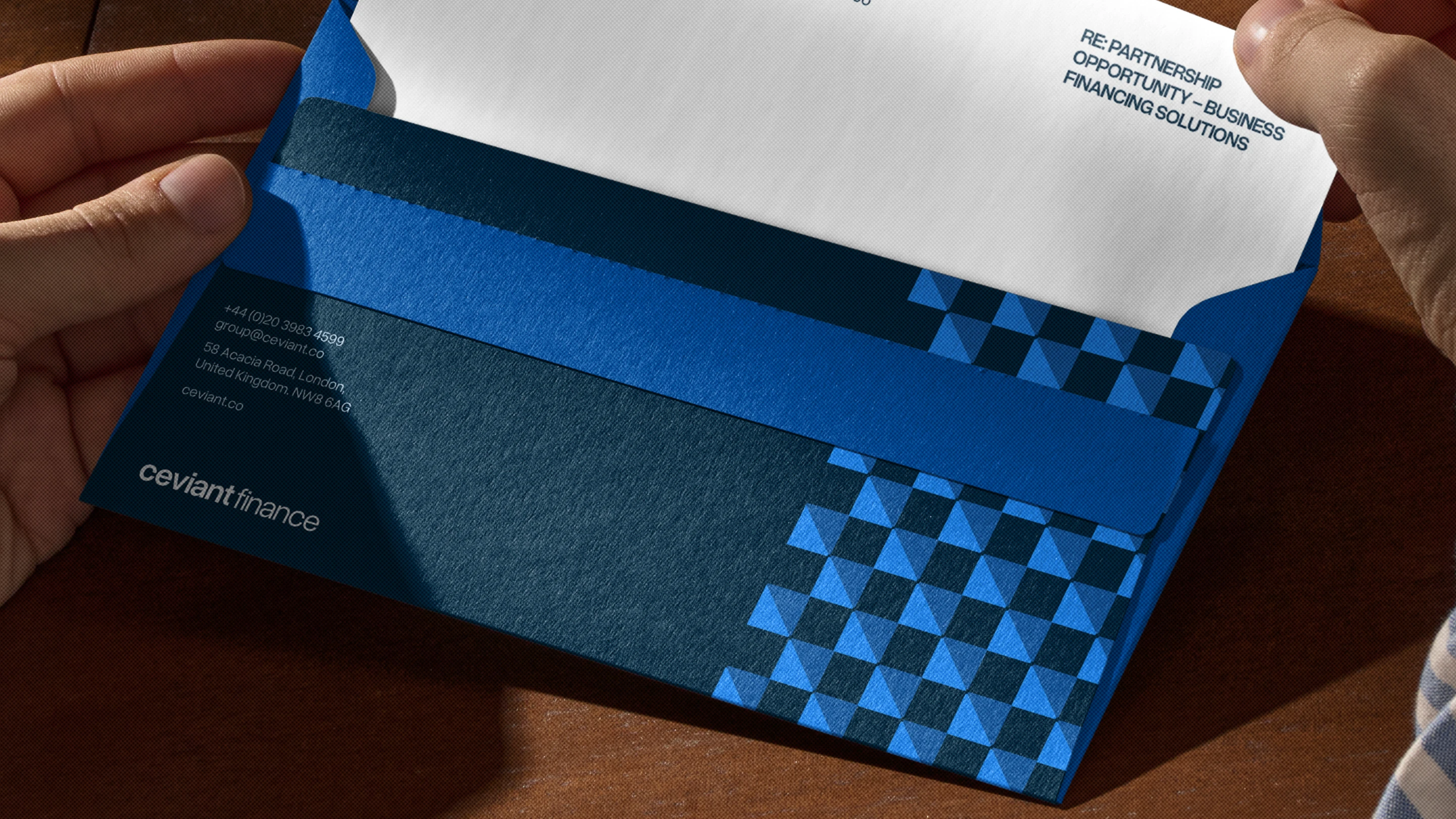
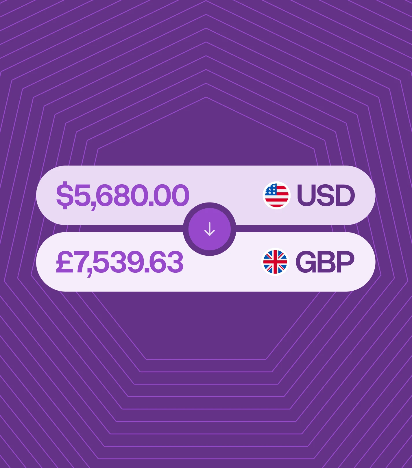
Ceviant operates as a UK-based financial services ecosystem. In this ecosystem, there are four separate licensed operations. They include: Ceviant Finance, Ceviant Asset, Ceviant X, and Ceviant Pay. Each carries distinct regulatory implications and risk boundaries.
There's a great risk in collapsing these entities into a singular identity. But at the same time, they all had to express a shared operational backbone (leveraged equity).
We understood the tension and articulated it. Our brief was to create a brand where the units have an obvious connection, but are never fused.
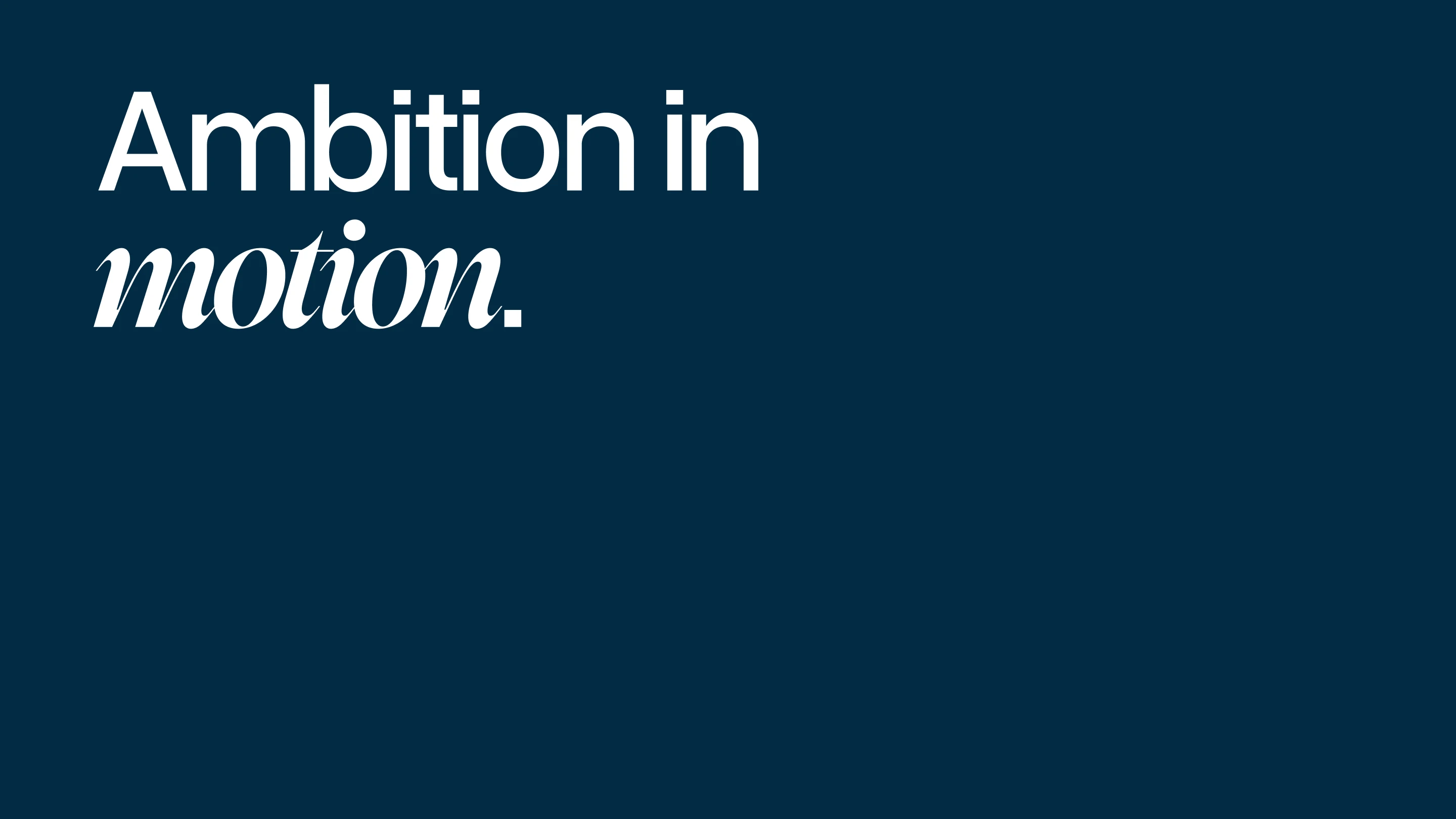
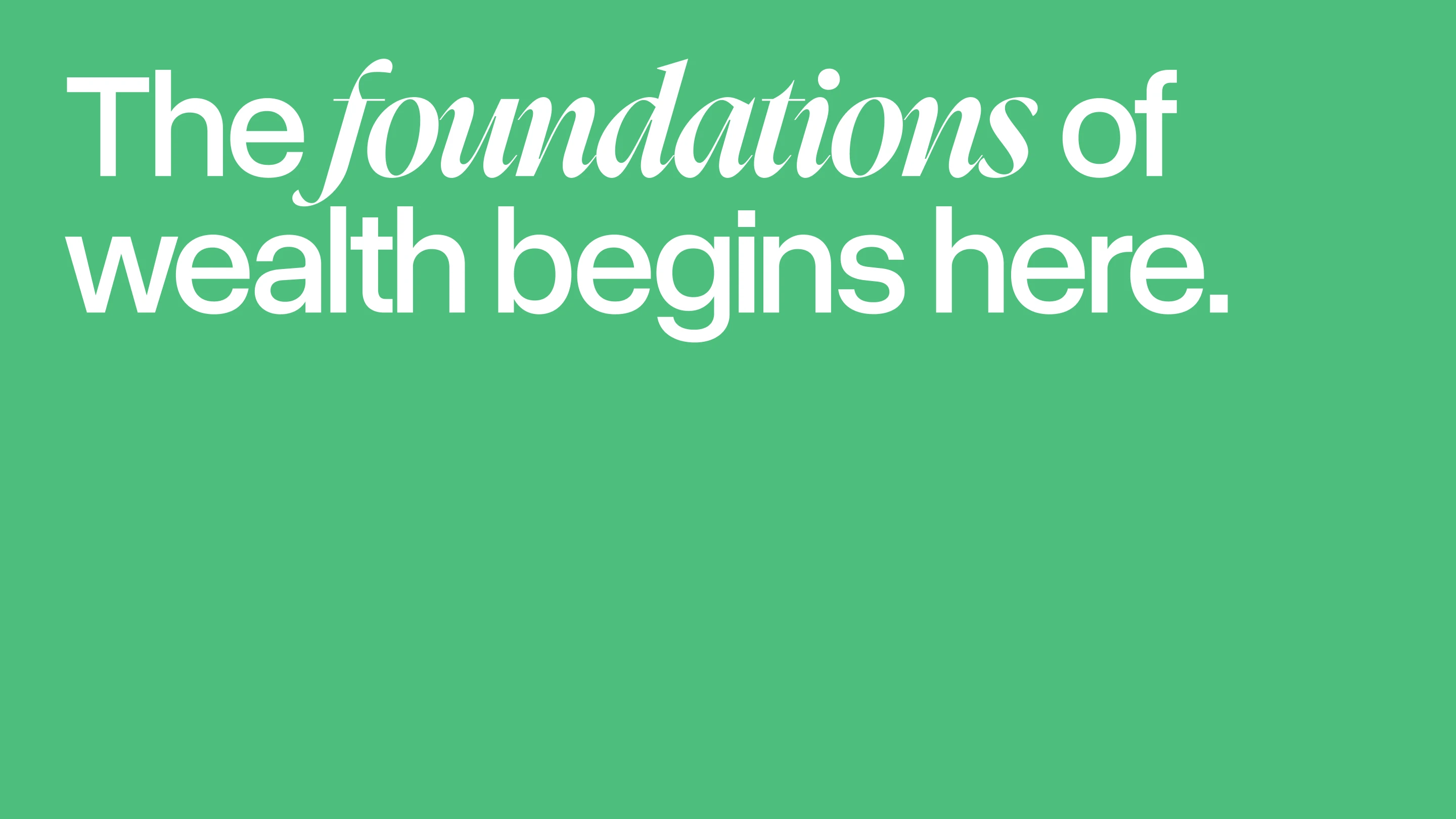
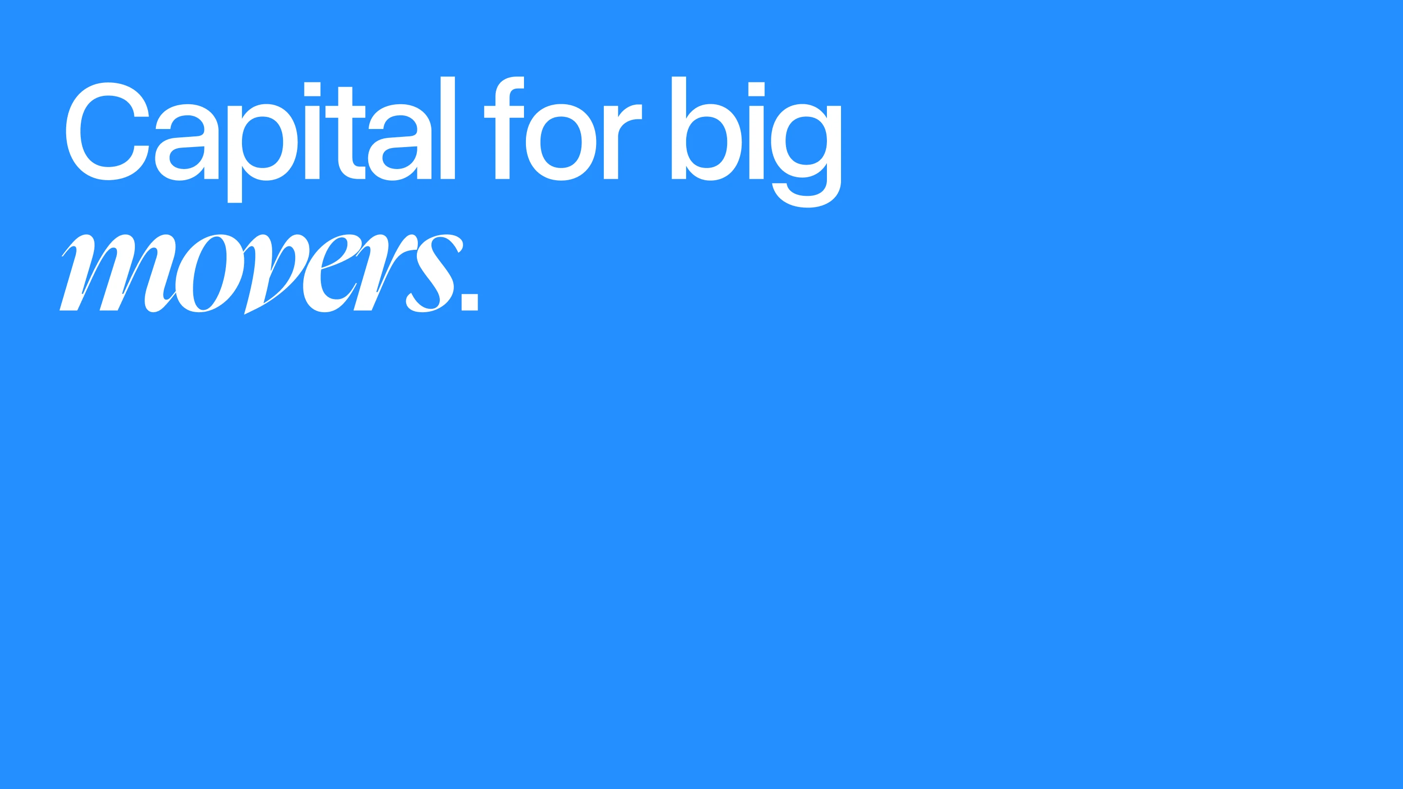
Connected. Never fused.
And so, we approached the design process thus: One backbone—several standalone expressions.
This was our attempt to encode Ceviant's governance model in visual form. Hence, making the regulatory-compliant structure legible through design.
For a design audience, here is how we brought that principle to life.
One logo, many personalities
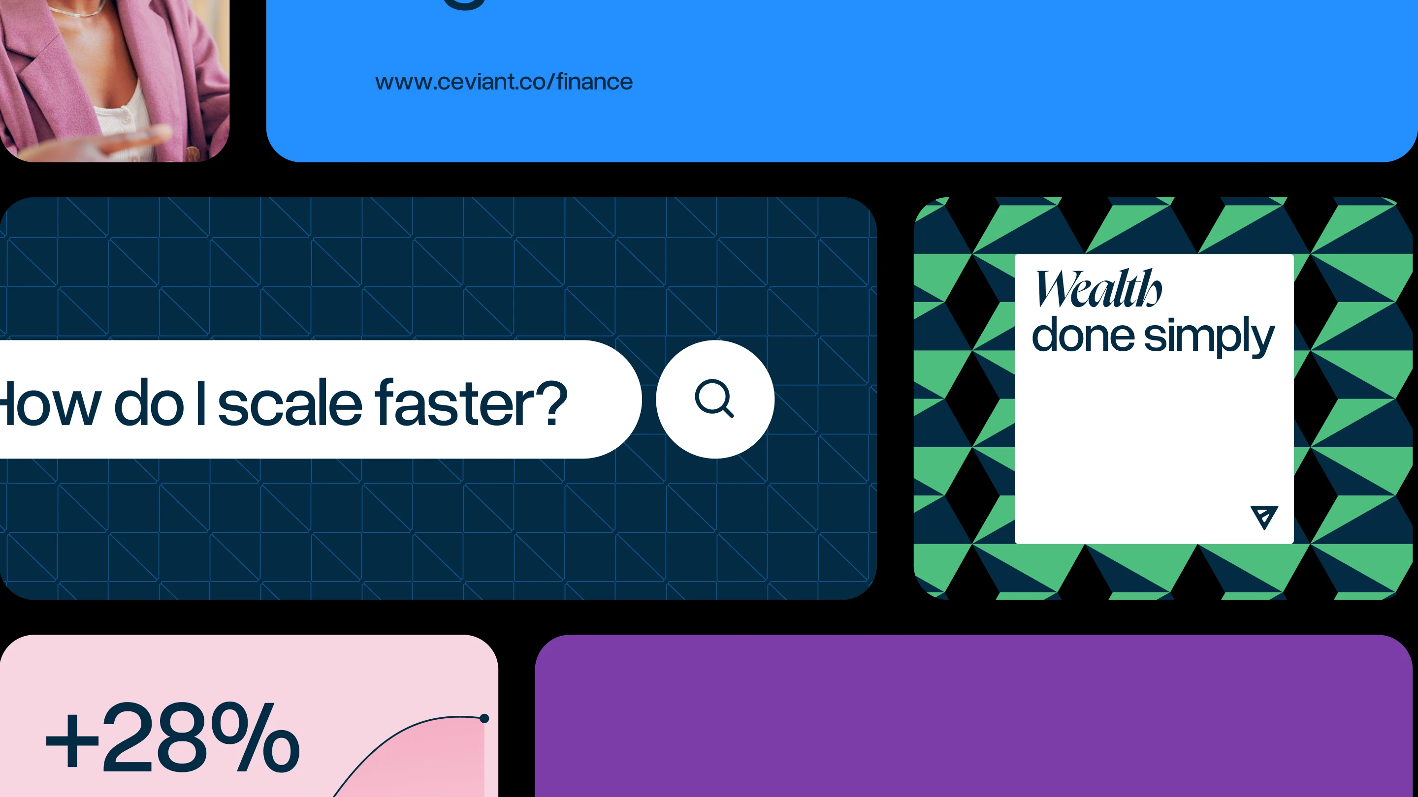
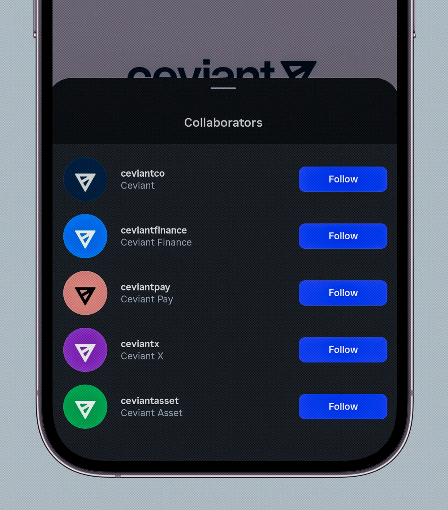
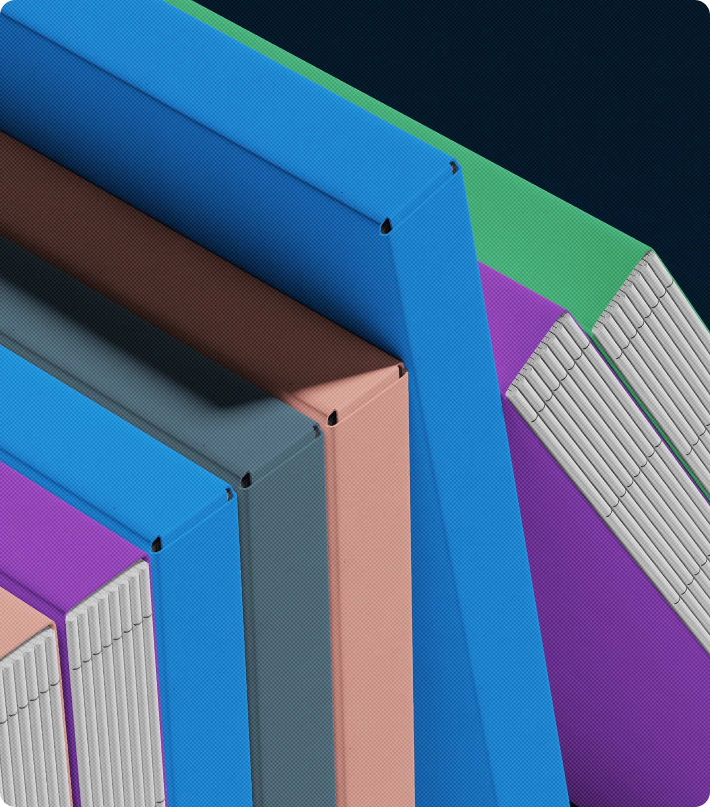
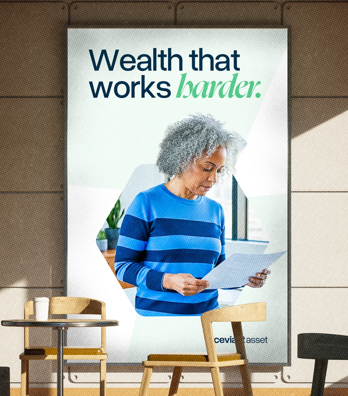
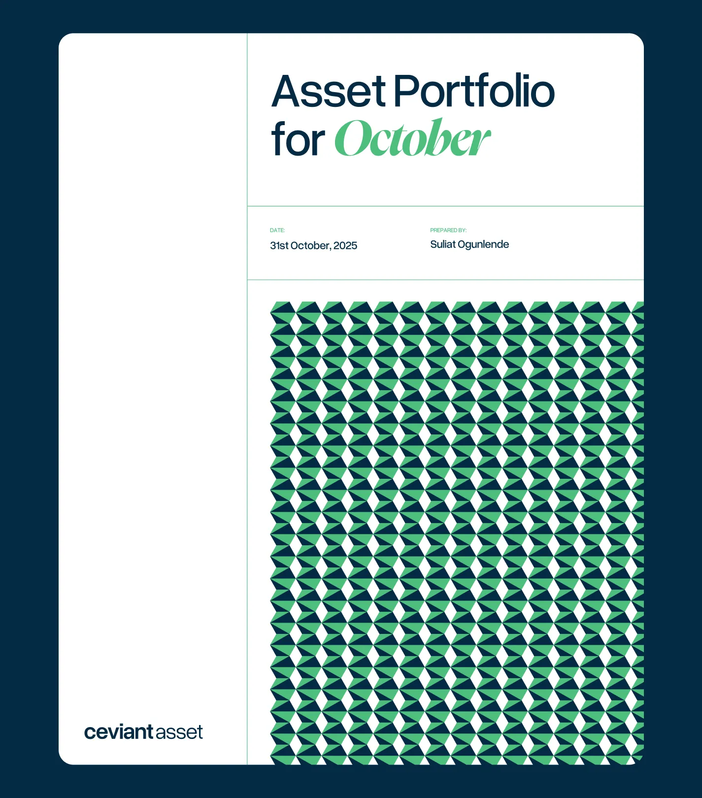
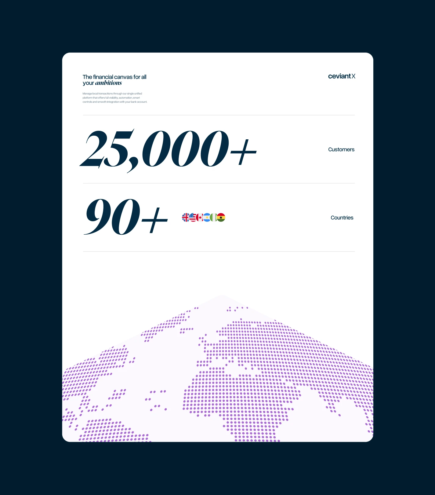
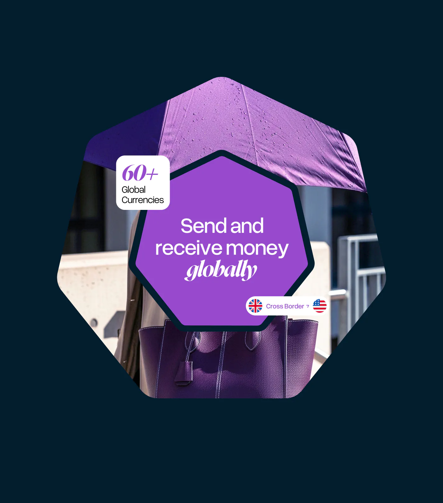
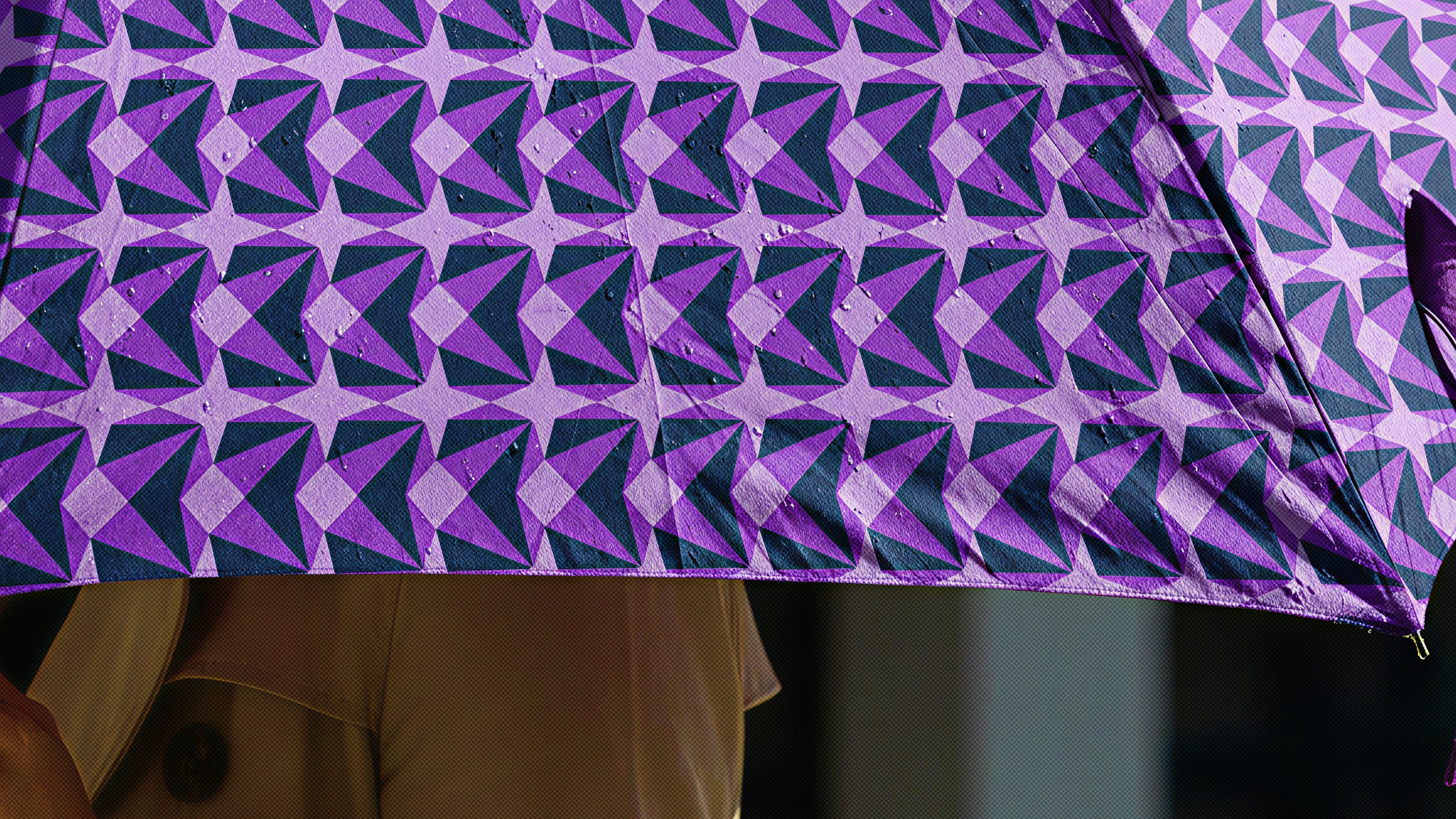
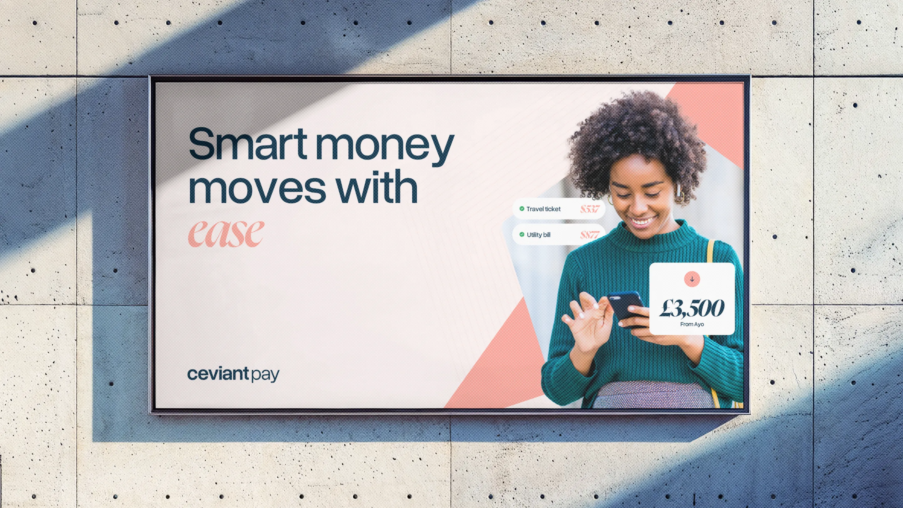
To bring this principle to life, we built a universe of expression around the consistent, shared mark rather than creating new logos. This universe has two core components. We selected smart colours, with a palette for each sub-brand that tells a story about its specific offerings. We also expanded the original triangle (the brand's DNA) into a family of related polygons, assigning a unique one to each sub-brand. This polygon became the core asset of its visual language, influencing layouts, container shapes, patterns, and textures. This approach gave each sub-brand its own distinct style while ensuring it still looked like part of the Ceviant family.
Balancing modernity and trust
The brand identity needed the gravitas of traditional finance. But it needed to avoid a dated aesthetic or an inaccessible visual outlook.
We struck this balance with typography. We paired a modern sans-serif (Overused Grotesk) with an institutional serif (Nyght Serif). This pairing strikes that exact balance between modernity and trust. It also ensures that we speak to all brackets in the customer base.
The Outcome → Autonomy in unity
This new brand language solves the original paradox. Each sub-brand now has the visual tools to function as a distinct entity in the market. It has its own colour story, geometric signature, and expressive range. Ceviant Finance can speak to its own audience, separate from Ceviant Pay. Ceviant Asset can build its own visual world, separate from Ceviant X.
Yet despite this autonomy, they're never orphaned. The shared logo and structural logic keep them tethered to the ecosystem. Customers and regulators can see both the separation and the connection simultaneously.
The system is, by design, generative. As the ecosystem grows, new entities can enter the family without a wholesale rebrand. They inherit the backbone, choose their polygon, select their palette, and immediately belong. Distinct, yet undeniably Ceviant.
This is how identity becomes infrastructure.
Connected. Never fused.